brand alignment
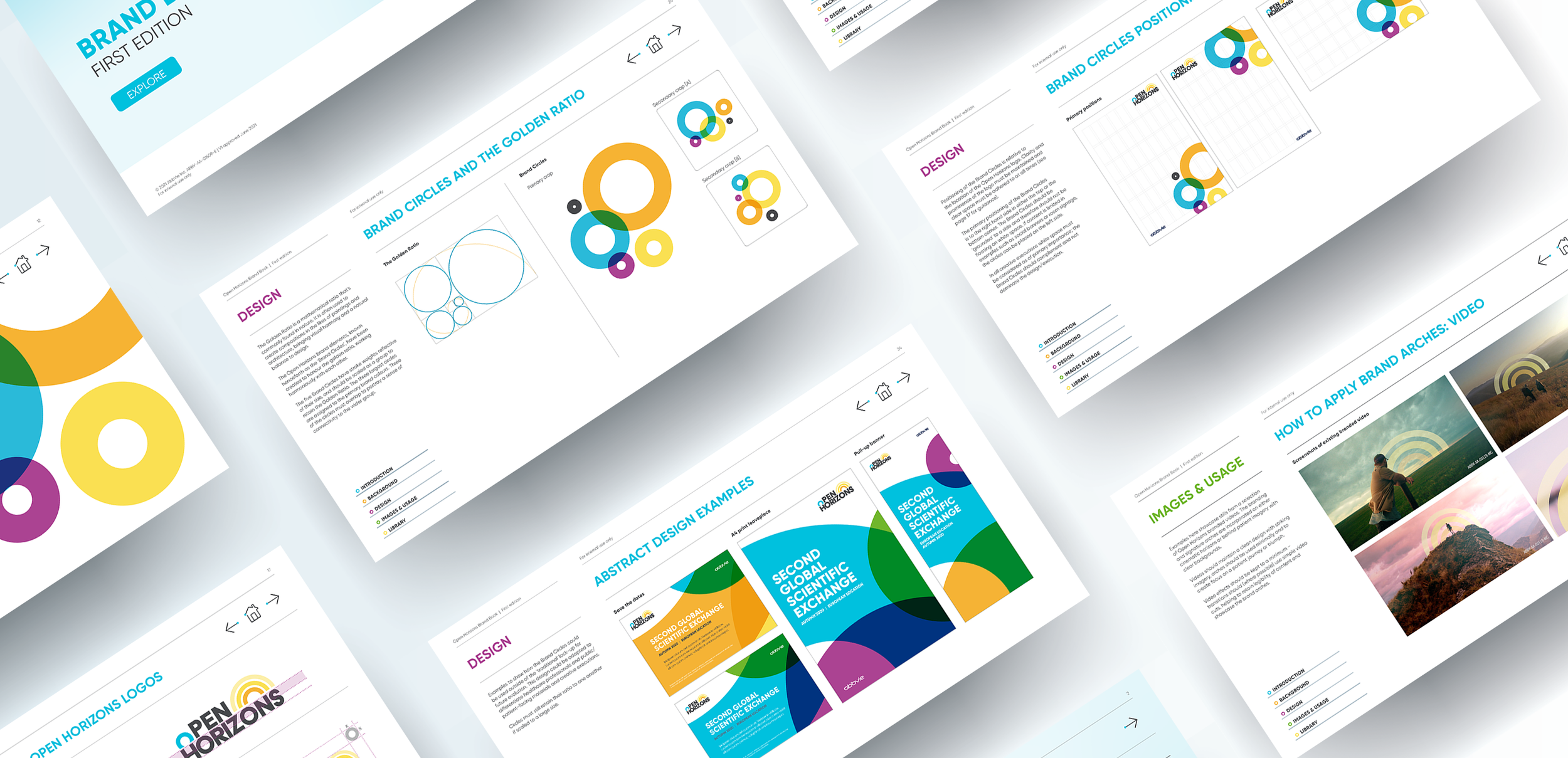
Creating an extensive brand book encapsulated the development, helping to guide the client teams and providing much needed direction to other agencies.
Including templates, layout structure, visual examples and circle lock-ups, the guidelines encompassed all aspects of the brand, including more abstract visuals for future development.
Open Horizons’ branding uses bright colours combined with circles, however there hadn’t been a clear set of rules to help direct designs. Establishing a design system for use on all communications was the key to creating a clear and consistent visual identity.
Re-aligning the brand was first routed in the golden ratio. Using only these measurements and an evolved colour palette, the essence of the brand – the circles – started to take on a much more structured identity.

Explore similar projects


